Add Image Placeholders to Google Slides Easily

Today we’re diving into a quick and practical tip for Google Slides—adding image placeholders to your custom themes or templates. This simple feature allows students to easily insert images into a set space, ensuring consistency and maintaining the design you’ve created.

In our last post, we discussed how to create custom themes for classrooms. Now, we’re taking it a step further with image placeholders. Whether you’re designing print-ready templates or interactive digital materials, this feature is a game-changer.

What Is an Image Placeholder?

An image placeholder in Google Slides is a designated space where users can easily insert an image. Unlike a regular image, placeholders don’t become part of the background—they’re dynamic and customizable. This makes them perfect for student templates where you want to guide where images should go, without students accidentally changing the layout.

How to Add an Image Placeholder

Adding an image placeholder to your template is super easy. Follow these steps:

  • Open your Google Slides presentation and go to the slide where you want to add a placeholder.
  • Navigate to Slide > Edit Theme. This opens the theme editor where you can customize layouts.
  • Select the layout you want to edit or create a new layout.
  • From the toolbar, click on Insert > Image Placeholder. You’ll see three options: rectangle, rounded rectangle, and oval.
  • Choose the shape that works best and drag it onto your slide to create the placeholder.

    And that’s it! You’ve added an image placeholder.

    How Students Use the Placeholder

    When students use your template, here’s what they’ll see:

    • The placeholder appears as a box labeled “Replace Image.”
    • Students can click on the box and choose Replace Image from the toolbar.
    • From there, they can insert images from the web, their drive, or other sources.

    Once the image is added, it might not fit perfectly. Students can double-click to adjust the size or reposition the image within the placeholder (using the blue outline). It’s intuitive and easy for them to use.

    Classroom Applications

    Image placeholders are especially useful in educational templates. For example:

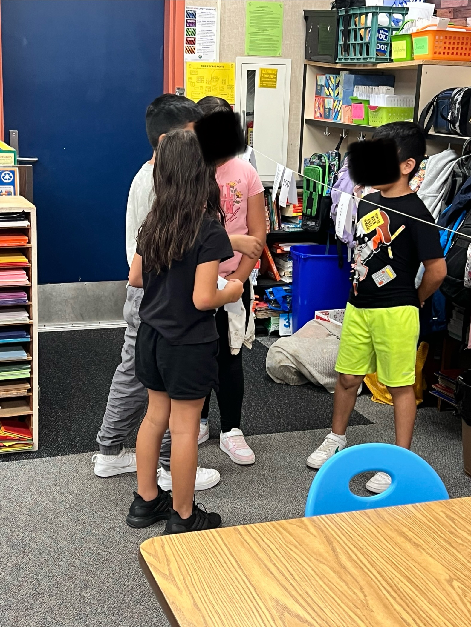
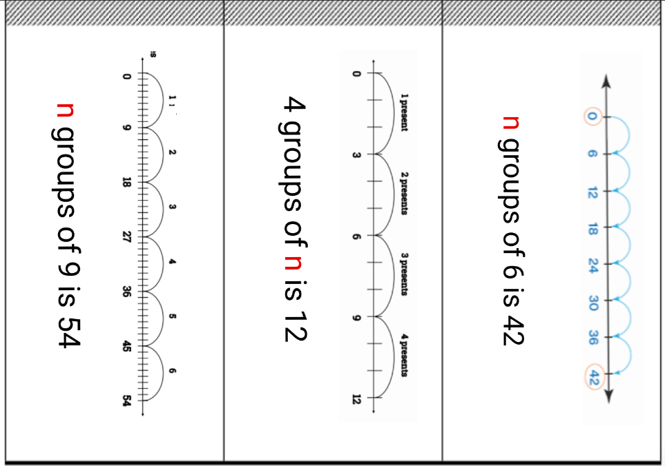
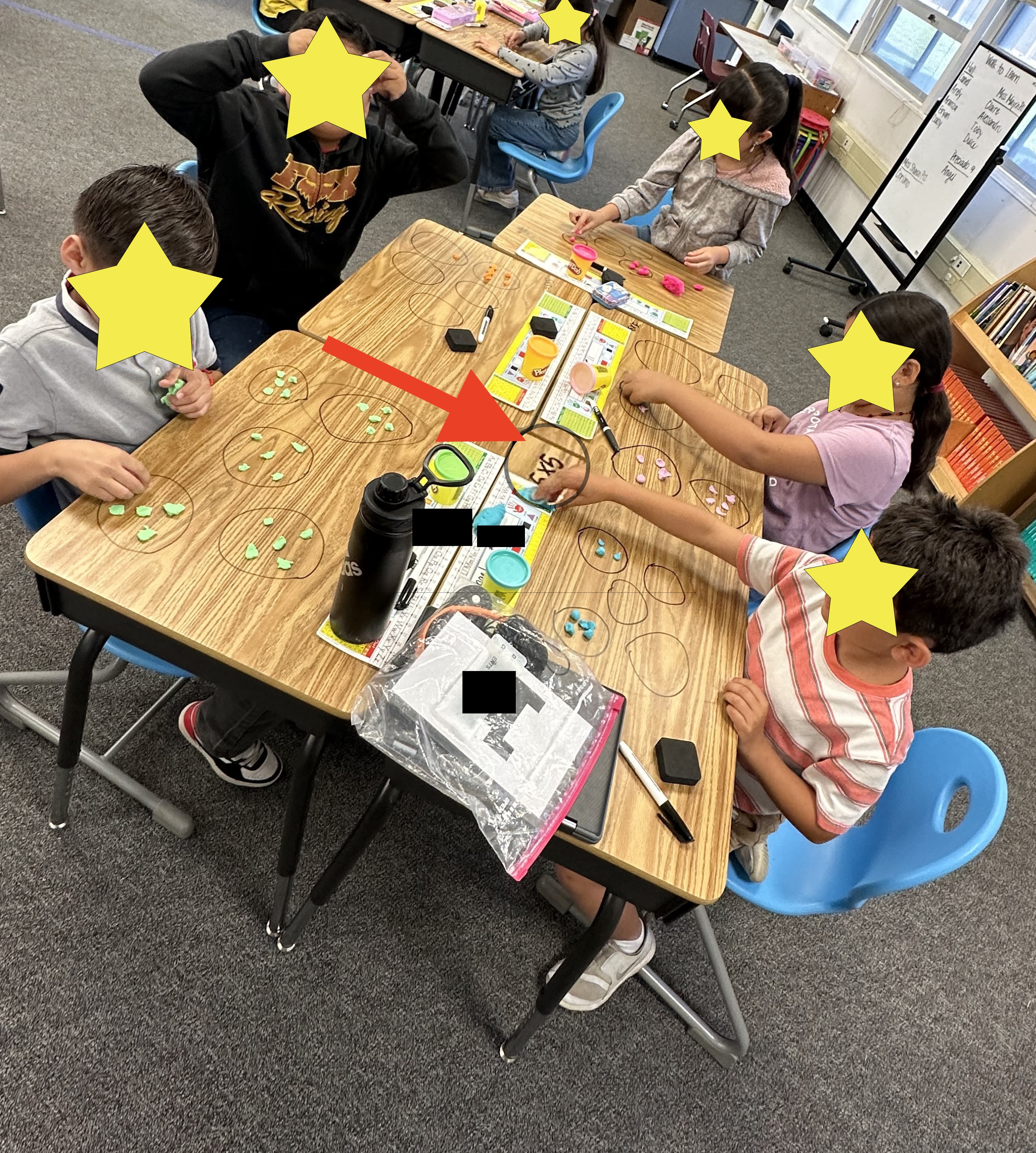
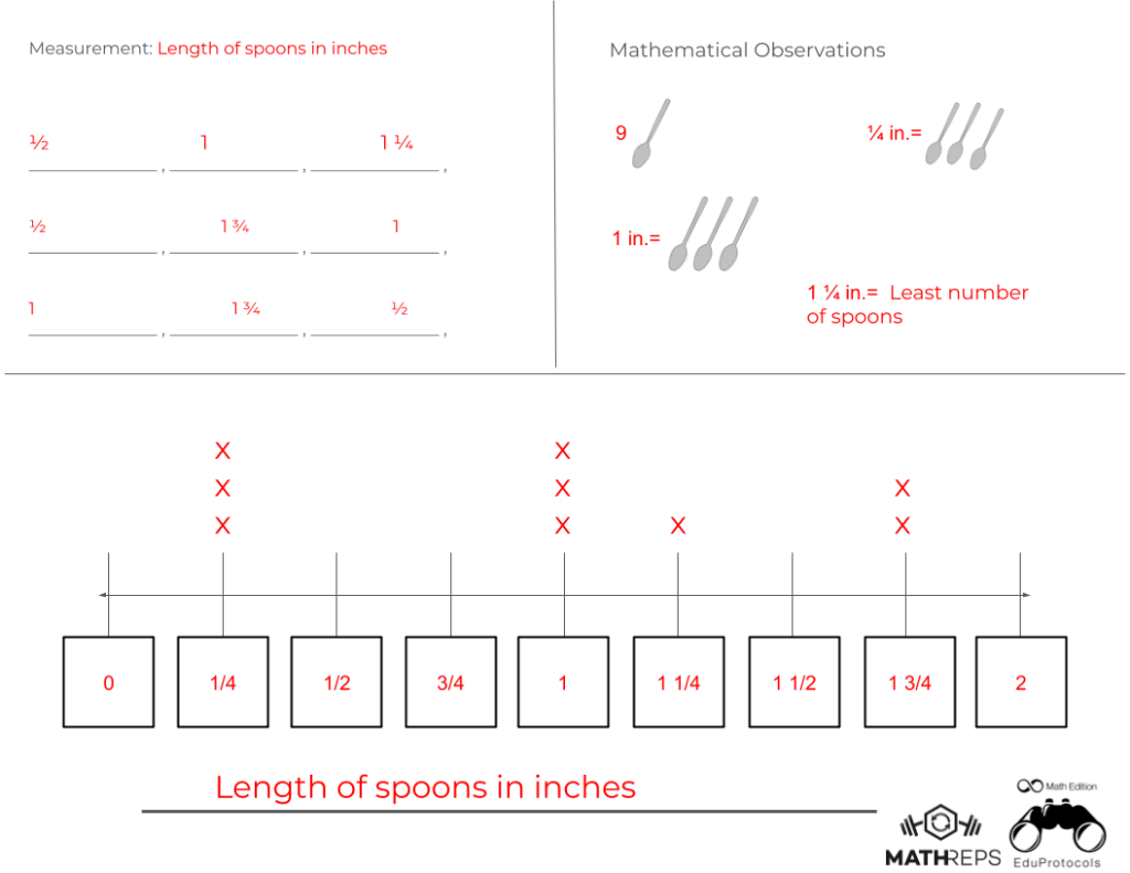
    • Math Activities: Use placeholders for students to insert images representing equal groups, fractions, or geometric shapes.
    • Science Projects: Students can add diagrams or pictures for their reports.
    • Creative Assignments: Templates for digital art projects or storytelling.

    The placeholders ensure students stay within the layout, keeping the template neat and organized.

    Adding image placeholders in Google Slides is a quick and simple way to create interactive and visually appealing templates. This feature keeps your layouts consistent while giving users the freedom to add their own images.

    If you enjoyed this tip and want to see more, don’t forget to subscribe here or on my YouTube channel. Stay tuned for my next post to explore more quick tips using Google Slides. Happy creating, and see you next time!

    Create Custom Google Slides Themes: A Step-by-Step Guide

    Today’s tip is all about creating your own Custom Theme in Google Slides. Whether you’re designing presentations for your classroom, professional meetings, or digital work for your classroom, custom themes ensure consistency, efficiency, and a polished final product. Let’s dive in!

    Why Use a Custom Theme?

    Custom themes offer several benefits:

    • Consistent design across all slides.
    • Easy to replicate layouts for multiple presentations.
    • Prevent accidental changes by students in classroom settings.
    • Save time with reusable templates.

    Accessing the Theme Editor

    1. Open a Google Slides presentation.
    2. Go to Slide > Edit Theme.
    3. This opens the Theme Editor, where you can customize layouts, fonts, and colors.

    Customizing Fonts and Layouts

    • Select a layout from the left panel.
    • Click on any text element and change the font (e.g., Montserrat).
    • Changes will apply to all slides using that layout.

    Pro Tip: Stick to 1-2 fonts for a clean, professional look.

    Adding Design Elements to Layouts

    • Use shapes (e.g., circles, rectangles) for design consistency.
    • Customize with gradient backgrounds and border styles.
    • Duplicate shapes and align them for a cohesive layout.

    Creating Print-Ready Templates

    • Choose a Blank Slide Layout.
    • Use shapes and lines to design specific templates (e.g., Freyer models).
    • Customize with placeholders for consistent structure.

    Adding Placeholders

    Placeholders define editable and non-editable areas:

    • Text Placeholder: Editable text areas for user input.
    • Text Box: Static text areas for instructions or headers.

    To add a placeholder:

    1. Go to Slide > Edit Theme.
    2. Choose Insert Placeholder from the toolbar.
    3. Adjust its position and size.

    Creating a Student-Friendly Template

    For classroom activities:

    • Lock instructional text and static design elements.
    • Create editable sections only where students need to type.
    • Use gridlines for models (e.g., area models).

    Final Touches and Testing

    • Switch to the normal slide view. Select a slide from the left panel.
    • Test your template by adding a new slide.
    • Verify that only editable placeholders are modifiable.

    Creating custom themes in Google Slides is an excellent way to save time, maintain consistency, and improve the quality of your presentations and worksheets. Explore text and image placeholders in upcoming videos!

    If you found this guide helpful, don’t forget to check out my YouTube channel for more tips. Happy designing, and see you soon!

    How to Set Custom Dimensions in Google Slides for Printing

    How to Customize Page Size in Google Slides

    Welcome! Today, we’re exploring a super practical tip for Google Slides: Custom Page Size. Did you know you can set your slides to 8.5 x 11 inches? This makes them perfect for worksheets, handouts, or any printable materials. Let’s dive into this step-by-step guide and make your slides print-ready!

    Why Customize Page Size?

    Google Slides defaults to a widescreen format (16:9 ratio). While this is great for digital presentations, it’s not ideal for printed materials. Customizing your page size ensures:

    • Full-page printouts without unnecessary white space.
    • Better scaling and alignment for worksheets and notes.
    • Professional-looking handouts.

    Accessing Page Setup

    Follow these simple steps to customize your page size:

    1. Open your Google Slides presentation.
    2. Go to File > Page Setup.
    3. A dropdown menu will appear with default aspect ratios:
      • Widescreen (16:9)
      • Standard (4:3)
      • Widescreen (16:10)
    4. Select Custom from the dropdown menu.

    Setting Custom Dimensions

    When you select Custom, you’ll see input boxes for dimensions. Here’s how to set it up:

    1. Enter 8.5 x 11 inches (or reverse for landscape: 11 x 8.5).
    2. Click Apply.

    All your slides will now resize to match the new dimensions.

    Note: The custom size applies to all slides in your presentation—you can’t mix different sizes in one slide deck.

    Preview and Print

    After customizing:

    • Review your slide content to ensure everything fits properly.
    • Go to File > Print Preview to see how it will look on paper.
    • Adjust text, images, and elements if needed.

    Now, when you print, your content will fill the page without awkward white spaces!

    Practical Uses for Custom Page Sizes

    Custom slide sizes are perfect for:

    • Worksheets for classroom activities.
    • Printable newsletters or notes home.
    • Creative posters and flyers.
    • Customized certificates or templates.

    Final Tips

    • Double-check alignment before printing.
    • Use high-resolution images for the best print quality.
    • Save your customized template for future use.

    Customizing page size in Google Slides is a simple yet powerful tool. It eliminates printing frustrations and ensures your materials look polished and ready to go.

    If you enjoyed this tip subscribe here or on my YouTube channel for more Google Slides tricks. Happy designing, and see you next time!

    Elevate Your Slides with Custom Gradients

    Today, we’re diving into the world of custom gradients in Google Slides. Adding custom gradients is an excellent way to give depth and dimension to your backgrounds, shapes, or word art. Let’s explore how to create and customize gradients step-by-step. This guide is excellent for teachers, students, and professionals.

    Introduction to Gradients

    Gradients are a powerful tool for creating visually engaging designs. Google Slides offers two types of gradient options:

    • Preset Gradients: Pre-designed color transitions like light-to-dark or center-focused gradients.
    • Custom Gradients: Fully customizable gradients with multiple colors, stops, and directions.

    This guide will focus on creating custom gradients to unlock your creative potential.

    Applying a Gradient Background

    Start by applying a gradient to your slide background:

    • Click on the Background button in the toolbar.
    • You’ll see the default solid color options. Switch to the Gradient tab.
    • Choose a preset gradient color, such as green, and click Done. You’ll notice how the gradient adds depth, transitioning from darker edges to lighter areas.

    Customizing Gradient Colors

    To create a custom gradient:

    1. Go back to the Background menu and select the Gradient tab.
    2. Scroll down and select Custom under the Simple Light section to open the customization panel.
    3. Add and adjust gradient stops:
      • Click Add Stop to include additional colors.
      • Choose colors for each stop (e.g., start with light green, then add purple, and finish with dark blue).
      • Drag stops along the gradient bar to control the color transitions.
    4. Preview your custom gradient in the panel before applying it.

    Adjusting Gradient Settings

    Take your customization further by adjusting these settings:

    • Gradient Type:
      • Linear: Creates a straight gradient with customizable angles.
      • Radial: Creates a circular gradient radiating out from the center or another point.
    • Angle: Adjust the angle of linear gradients (e.g., 45 degrees) to change the direction of the gradient.
    • Radial Position: Choose center, edge, or other starting points for radial gradients.

    Once you’re satisfied, click OK and then Done to apply your gradient.

    Using Gradients with Shapes and Word Art

    Custom gradients aren’t just for backgrounds—you can apply them to shapes and word art as well:

    • Select any shape or word art.
    • Use the Fill Color tool and choose Gradient to apply a preset or custom gradient.
    • Access the Custom Gradient option to create unique designs.

    Sharing and Customization Tips

    Gradients can be a fun and engaging tool in classrooms or collaborative projects. Consider preparing several gradient templates for students or team members to explore and modify. Encourage experimentation to spark creativity!

    Creating custom gradients in Google Slides is a simple yet powerful way to elevate your designs. Whether you’re working on a professional presentation or a creative project, these tools will help your slides pop and shine.

    If you enjoyed this guide, be sure to subscribe to my blog, NowaTechie, or YouTube channel for more quick tech tips. Happy creating!

    Master Image Cropping in Google Slides

    We’re diving into the world of image cropping in Google Slides. Whether you’re a teacher, student, or someone who loves to create professional presentations, knowing how to crop images effectively can take your slides to the next level. Let’s explore how to do it step-by-step. Grab a coffee, relax, and let’s get started!

    Inserting an Image

    First, let’s add an image to your slide. Here’s how:

    • Open a blank Google Slide.
    • Use the Insert Image tool (a little square with mountains on it) and select Search the Web.
    • Search for an image—for example, “puppies”—and insert it onto your slide.

    This is your starting point. From here, you can modify the image to better fit your needs.

    Basic Cropping Techniques

    There are two simple ways to crop your image in Google Slides:

    • Method 1: Double-click the image to bring up black crop lines around it. Adjust the image size by dragging the edges, then click outside the image to finish.
    • Method 2: Use the Crop Image tool in the toolbar. Select the tool, and you’ll see the same black crop lines appear. Adjust as needed and click away to finalize.

    Both methods let you trim the image without affecting the original file.

    Cropping Using Shapes

    For a fun twist, you can crop your image into custom shapes:

    • Click the down arrow next to the Crop Image tool.
    • Choose a shape, like a heart or a rounded rectangle.
    • Adjust the shape using the yellow diamond handle for curves or specific angles.

    This feature is especially popular in classrooms or for creative projects. For example, rounded rectangles with a slight curve can give your slide a modern look.

    Formatting Borders

    Enhance your cropped image with a border:

    • Click the pencil icon (Border Color) to select a border color.
    • Use the Border Weight option to adjust the thickness.
    • Experiment with border styles, like dashed or dotted lines.

    While playful borders might not suit formal presentations, they’re a hit with students and can add flair to informal slides.

    Advanced Formatting Options

    Take your images to the next level with advanced formatting tools:

    • Drop Shadow: Add a shadow under your image for depth. Adjust the color, distance, angle, and blur to customize the effect.
    • Reflection: Create a mirrored effect below the image. Modify the size, distance, and opacity for a polished look.

    These options make your slides visually dynamic and engaging.

    Accessibility Features

    Google Slides includes tools to make your presentations more inclusive:

    • Use Alt Text to describe images for visually impaired viewers. Google often auto-generates this, but you can edit it for clarity.
    • Add a title or description to provide additional context for screen readers.

    These small adjustments can make a big difference for your audience.

    Cropping images in Google Slides is simple, versatile, and fun! With these techniques, you can create polished, engaging slides that stand out. Whether you’re in a classroom or boardroom, these skills will elevate your presentations.

    If you found this guide helpful, don’t forget to like, subscribe, and hit the bell on my YouTube channel for more tech tips. See you next time!

    Elevate Your Google Slides with Custom Word Art

    Custom Word Art

    In this quick tip, I’ll show you how to elevate your Google Presentations using the custom Word Art feature. Whether for school or professional use, you’ll learn how to add flair and make your slides stand out. Grab your devices, and let’s get started!

    Getting Started with Word Art

    Learn how to insert Word Art in Google Slides. Start by navigating to the “Insert” menu, selecting “Word Art,” and typing your text. Discover how to add line breaks by holding the Shift key and pressing Enter. With these simple steps, you’ll have the foundation for customized Word Art.

    Customizing Fonts for a Unique Look

    Breathe life into your Word Art by changing fonts. Explore Google’s font library to find styles that suit your presentation. From fun fonts like “Henny Penny” to more professional options, you’ll find endless possibilities to match your style.

    Adding Color and Gradients

    Use the fill color and gradient options to make your word art pop. Choose from solid colors, pre-designed gradients, or radial effects for a dynamic look.

    Enhancing with Borders

    Adjust the border color, weight, and style to add pizzazz to your word art. Experiment with solid, dashed, or dotted lines. While bold outlines can add fun, consider the context—subtle solid lines are better for professional settings, while dots and dashes are perfect for “Worst Preso Ever“.

    Resizing and Maintaining Proportions

    Easily adjust the size of your Word Art using the blue drag handles. For proportional resizing, hold the Shift key while dragging from the corners. This ensures your design stays balanced and visually appealing.

    Adding Shadows and Reflections

    Use formatting options to create drop shadows and reflections for depth. Customize shadow blur, distance, and color for the perfect effect. Reflections can also be adjusted for opacity and distance, adding a polished finish.

    Accessibility Tips

    Make your presentations inclusive by adding alternate text to Word Art. This step ensures screen readers can describe your visuals for visually impaired viewers, improving accessibility.

    Wrap-Up and Next Steps

    With just a few steps, your slides can go from plain to standout using Word Art. Experiment with these features and let your creativity shine. If you enjoyed this guide, subscribe for more tips and tricks delivered to your inbox!

    2 New Video Series Coming: Google & Math

    I’ve been diving into the world of videos lately, and it’s exhilarating to see the endless array of tutorials available at our fingertips. To contribute my own unique perspective, I’m launching TWO engaging series that I can’t wait to share with you. The first will unveil practical tips and tricks for using Google Tools effectively—because there’s always something new to discover! The second series will delve into math strategies tailored for both students and teachers, exploring everything MathReps has to offer. Get ready to enhance your skills and insights!

    I’m not sure when these will launch, but know for certain that they will be showcased here. The first Google tool I will be looking at is Slides. I plan to look at different components and dig into them. The goal is to keep the videos quick and engaging. Personally, I hate watching longer videos for the one piece of information I am looking for. I feel that by creating several Quick Tips, viewers can learn what they need to, quickly. As you can see from the image here, I’ll be covering Word Art in one of the first episodes.

    The series based on MathReps will contain information on MathReps, Math Eduprotocols, and other math strategies. Like the previously mentioned series, the videos will be bite-sized nuggets for viewers. I’m unsure when I’m starting that series, but I am just as excited to get it going. I have several thoughts: looking at MathReps and how to implement them, teacher tutorials on different math strategies we teach students and other helpful math tidbits.

    1. For Google Tools Series:
    • What’s one feature in Google Slides you’d love to master or learn a quick tip about?
    • Do you have a favorite Google Tool that you’d like to see covered in future posts or videos?
    1. For Math Strategies and MathReps:
    • Have you ever used MathReps in your teaching or learning? What’s been your experience?
    • What’s your go-to math activity that engages students most effectively?
    1. For Both Series:
    • Which series are you more excited for—the Google Tools or the MathReps and Strategies? Why
    • Is there a specific topic you’d like to see covered in either of these series? Share it here, and I’ll consider adding it!
    • Do you have any tips or shortcuts for Google Slides or math strategies that you’d like to share with others?

    Clothesline Math: Engaging Students with Interactive Learning

    For those unfamiliar with clothesline math, think of it as an interactive number line. Chris Shore is an outspoken champion of this hands-on teaching tool that helps students better understand Number Sense. This tool goes beyond placing numbers on a number line. It can be incorporated into most math concepts.

    Earlier this year, I introduced a group of 3rd-grade teachers to this concept. We started with a relatively simple concept to acclimate the students to the task. I copied Kristen Acosta’s 2nd Base 10 activity. In it, students were given a card and were tasked with understanding the number being represented. The example below (Kristen Acosta) shows different ways the numbers were represented. The students were then placed in groups of 3-4 and ordered their numbers. Then, each group went to the large number line (literal clothesline stretched from one end of the room to the other) and placed their numbers on the class number line. The slip of paper was folded so that the number ‘hung’ on the number line. You can also use clothes pins to secure the numbers in place. This led to many rich discussions on placement and spacing.

    Create Your Own

    This was a huge hit with the students and teachers. This led to teachers asking for others. We found a multiplication activity (Kristen Acosta). Then teachers wanted division, area and perimeter. Try as I might, I couldn’t find anything online that was already created. This, then, led to me creating them. This became a labor of love.

    Like other math resources I create, I looked at the standard and the framework when I created these. The division clothesline has various representations of division: standard form, number line, and images. In each the missing number could have been the quotient, dividend, or divisor. The missing number (n) is the number that is placed on the number line.

    It took me a bit to decide how to approach the area/perimeter. Ultimately, I decided that students should find either the area or the perimeter. I made sure that the students were exposed to a variety of images and challenges in order to find each. Some had a missing side, others only gave two side measurements to find the area or perimeter of a rectangle.

    Engaging Kids in Math: Using Play-Doh for Multiplication

    This school year, I have had the privilege of collaborating with several 3rd-grade teachers. During one meeting, I shared an innovative idea from a 4th-grade teacher, Ben Cogswell. He introduced the use of Play-Doh to help his students understand multiplication through hands-on activities. I really like how he incorporated MathReps into this lesson. In the accompanying image, you can see students recording their findings in a MathReps, along with an instructional video they can reference for guidance.

    Students using Play-Doh and MathReps to assist in their understanding of Multiplication and Division.

    Fast forward a few months into 3rd-grade. While meeting with one of the groups, one teacher, Jensen Hall, was excited to share that she had purchased some Play-Doh for her students to use as they begin learning about multiplication. Then, about a week later, she sends me this message with images:

    Message: I meant to send this to you earlier but I'm so excited about it I had to make sure I didn't forget again (sorry it's after hours). I introduced multiplication today using the play doh and it was a massive success! Such a great idea you shared!!
    Students showing off their work.

    Taking a closer look at the image, the red arrow points to where a student wrote out the problem on their desk. Using equal sets, students were able to model how to solve the problem. While the faces have been hidden, I can assure you that they were all smiling and clearly having a good time.

    We all want our students to be excited and engaged with math. In the rush to fit everything into a school day—assessments, end-of-the-year testing, and much more—we often forget how to make learning fun and hands-on. Starting with concrete models is essential when teaching new skills like multiplication. Taking the time to begin with concrete models will ultimately save us time later and allow students to truly understand these foundational skills, setting them up for future success.

    The story and images have been shared with permission from the teacher.

    Let’s (Line) Plot Something

    If you are a 3rd-grade teacher looking to engage students with the concept of line plots, you are not alone. The task of transferring data onto a number line may seem straightforward to adults, but for young learners, it can be quite challenging. The 3.MD.B.4 standard, a supporting cluster in the Common Core Standards, plays a substantial role in reinforcing the understanding of fractions and measurement. This means that as students delve into the world of line plots, they are simultaneously immersing themselves in the intricate connections between fractions on number lines, and measurement. It’s a perfect illustration of how math is both messy and beautiful, all intertwined in a way that connects to the real world.

    Putting It All Together

    Here is an example of what this integration could look like. This MathRep integrates the fractions on a number line and measurement. The information is collected in the upper left quadrant. Students then fill in the information on the line plot. In the upper right quadrant, they can record their mathematical observations. Much like in the previous blog post, the observations serve as a low-floor, high-ceiling activity—one that all students can access and be successful in.

    Teacher Set Up

    The MathRep method grants teachers flexibility. Its primary aim is to offer consistent learning experiences for students while minimizing the teacher's preparation workload. When implementing this approach, teachers can start by providing all the necessary data in the upper left quadrant and should ensure variation in the data to allow the line plot to start at different points. For example, if a line plot ranges from 0 to 2, it's beneficial to vary it so that it may start at 5 on one occasion and 9 on another. In 3rd grade, students typically work with whole numbers, halves, and fourths. However, the provided data may not always include fourths, so students should adjust the intervals accordingly. As students become proficient in recording data on a line plot, they can then be tasked with measuring objects, recording the data, and accurately placing it on the line plot. No matter where in the process you find yourself, be sure to encourage students to record all mathematical observations in the upper right quadrant. 


    Outcomes

    The outcomes of this MathRep further build students’ number sense, understanding of fractions, measurement, and data interpretation. It also illustrates how math concepts are interconnected and can be taught together instead of isolated. Another simple yet powerful activity. Have you tried it yet? What are your thoughts?